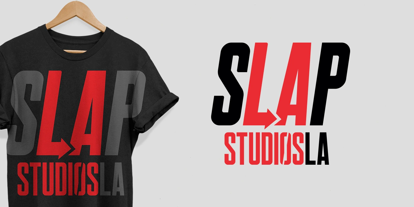
A high-impact identity for a studio making podcasts, productions, and events under one roof.
00 / Overview
Giving a new podcast and production space an immediate visual signature.
As SLAP Studios expanded into podcast production and began launching shows of its own, Agency689 created the studio logo, color system, and visual identity, then supported several early podcasts with naming and logo design.
Role Visual Identity Partner
Client SLAP Studios LA
Services Logo Design / Visual Identity / Color System / Brand Applications / Podcast Naming Support / Podcast Logo Design
01 / Studio Identity
Making the name feel like an action.
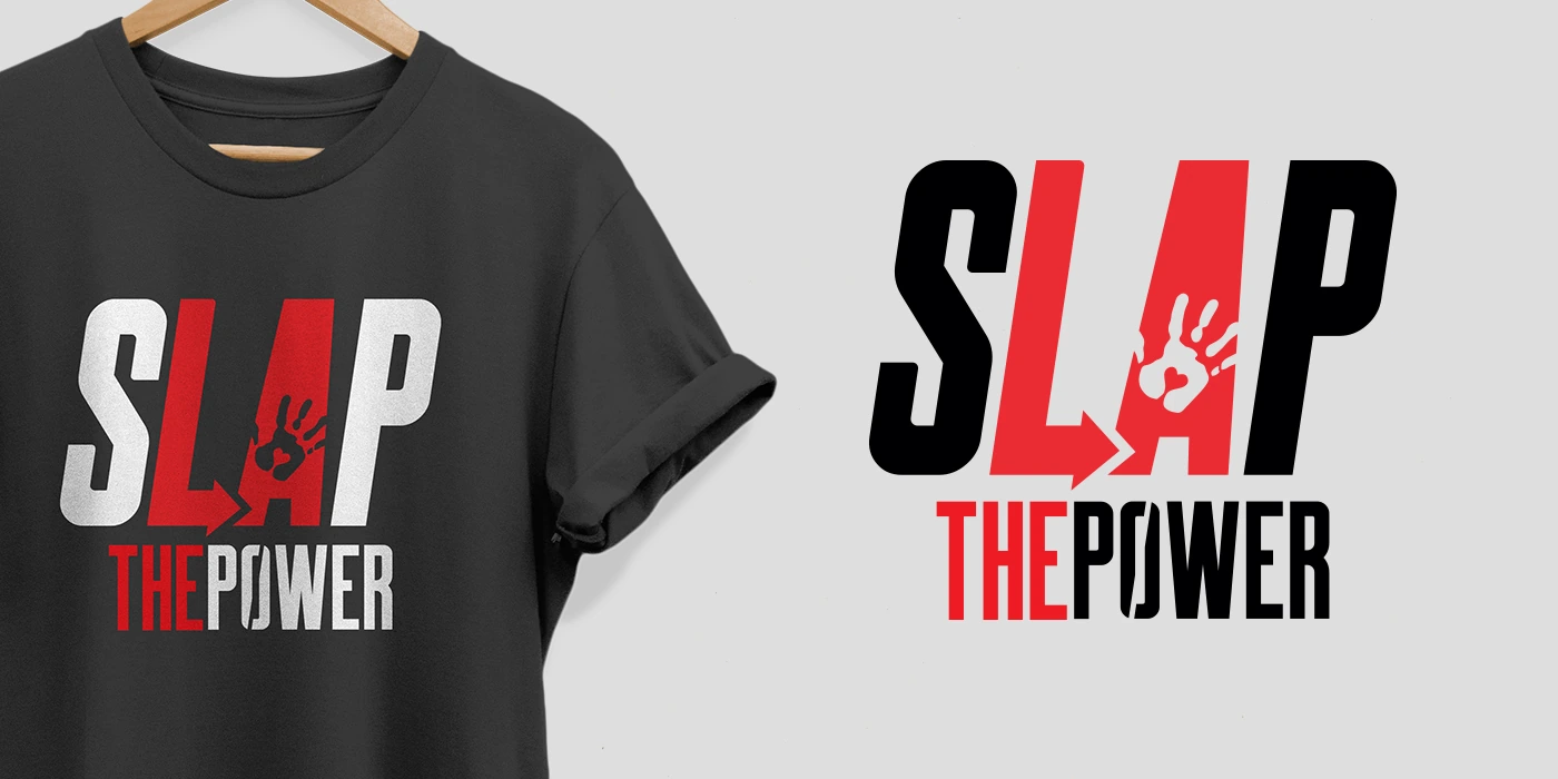
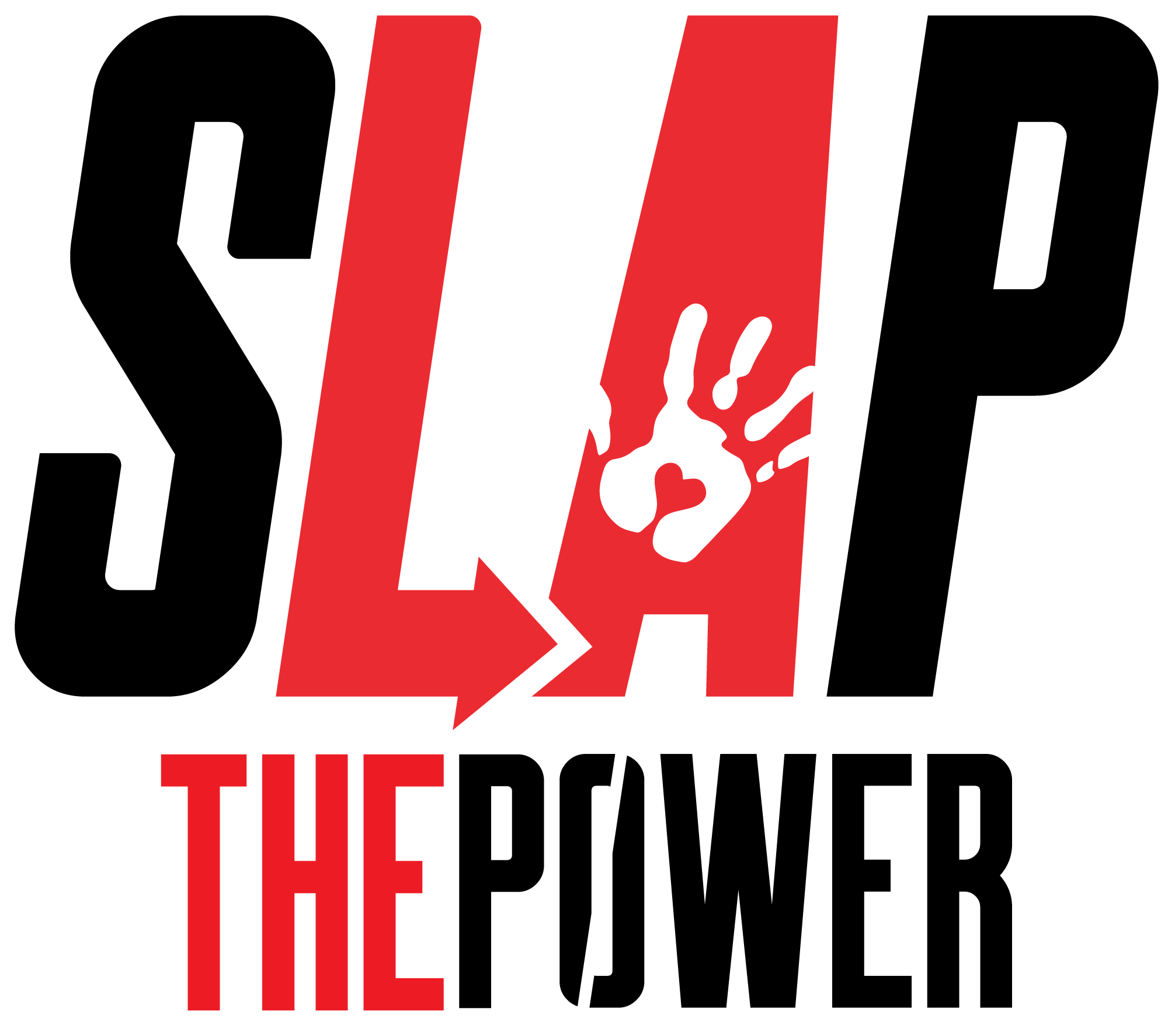
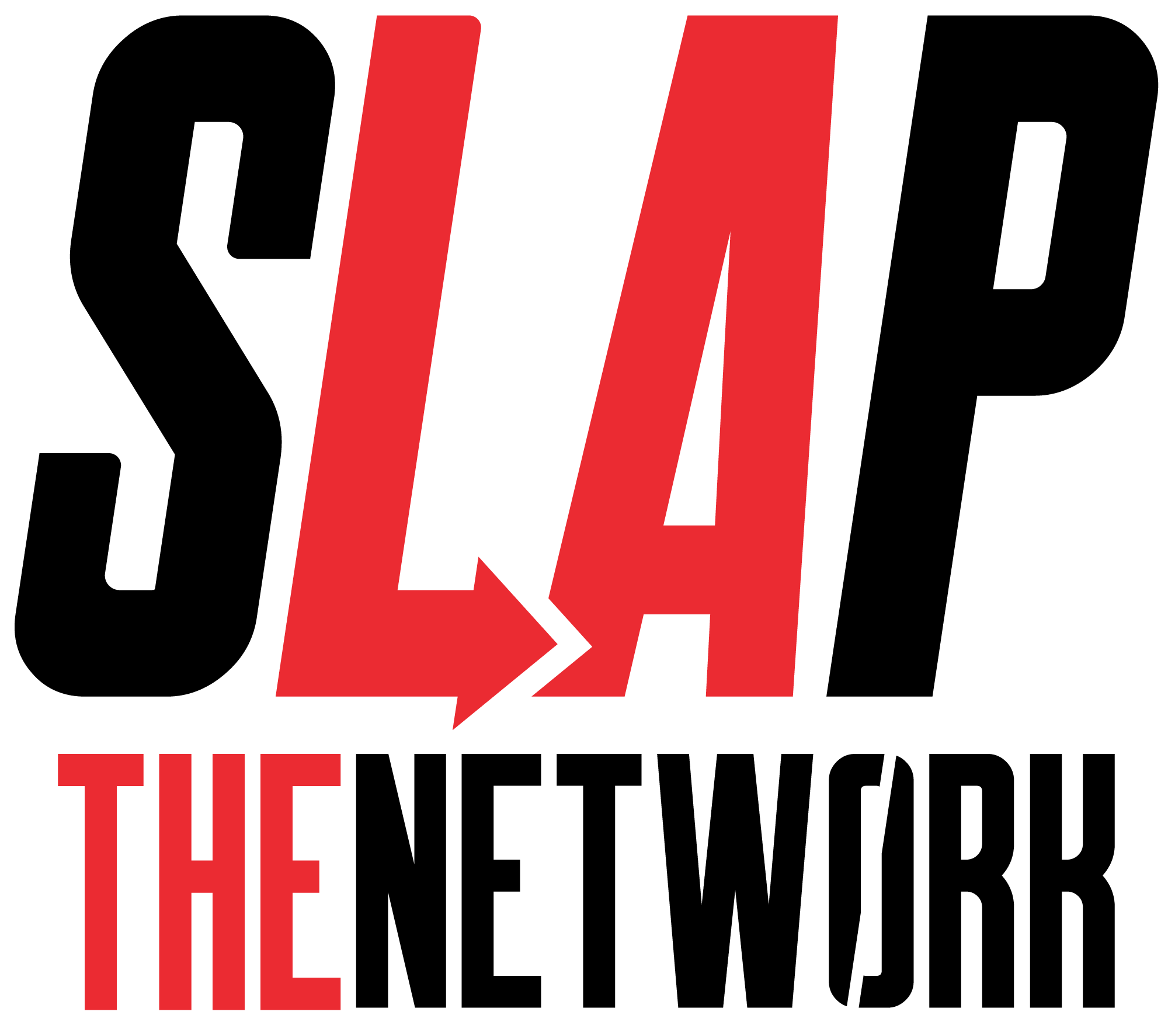
Compressed typography, directional letterforms, a red-black-white palette, and a handprint secondary mark gave SLAP a direct visual presence suited to production culture.
The final direction leaned into bold typography, a high-contrast red/black/white palette, and a handprint detail that made the brand feel immediate and recognizable.
02 / Applications
A graphic system that worked without extra decoration.
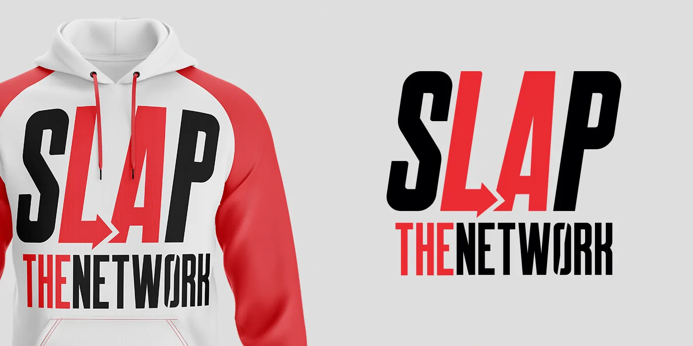
The core mark translated quickly across apparel, studio materials, social assets, and promotional graphics, keeping the identity recognizable in both large and compact applications.
The handprint works as a secondary mark, giving the system a smaller brand element for apparel, social assets, and quick-hit applications.
03 / Podcast Launch Support
Extending the studio’s energy into its first shows.
Naming and logo support gave several early podcasts distinct identities while maintaining the confident, production-minded context of the studio behind them.