


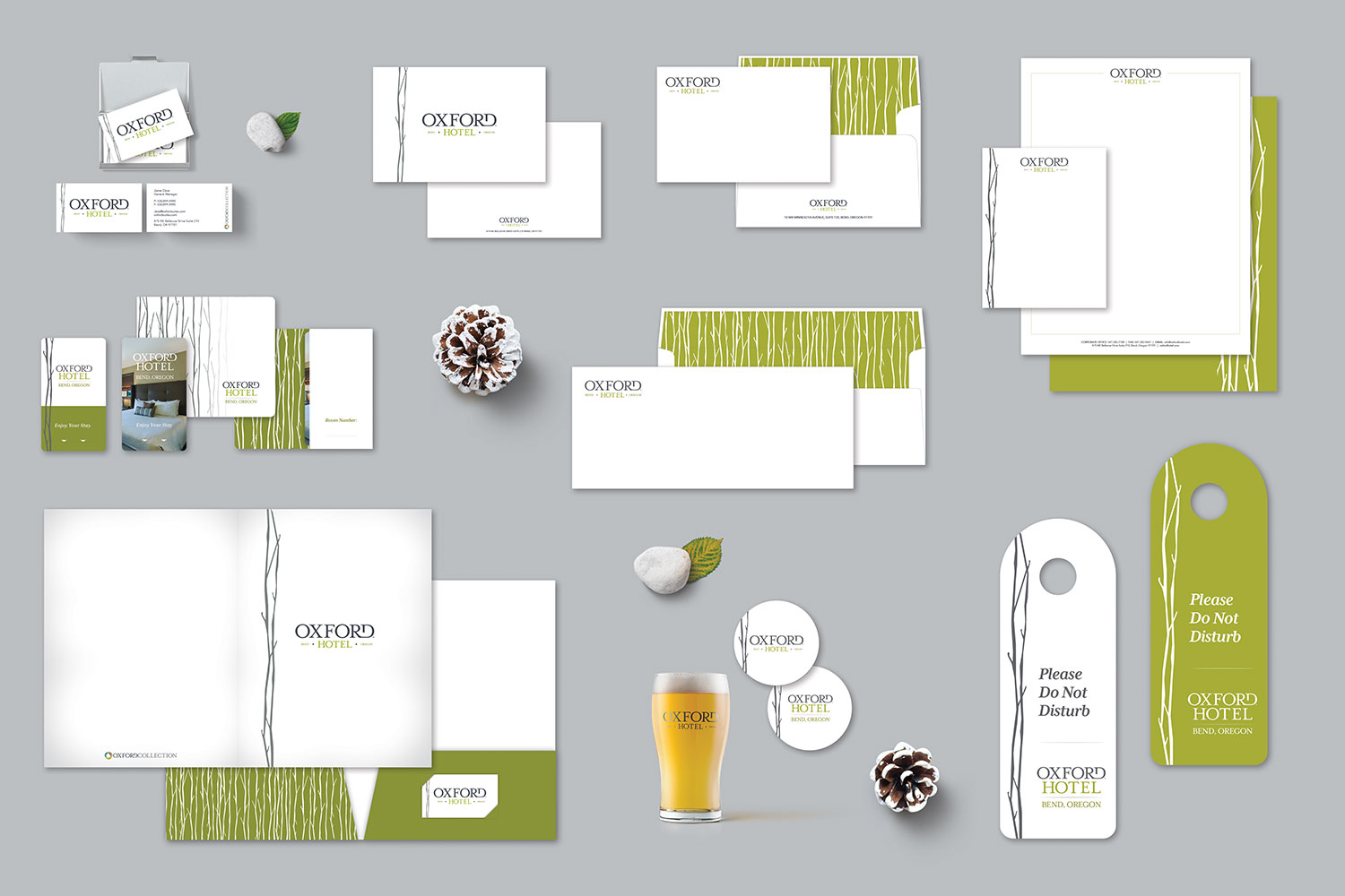

For the Oxford Hotel, we dropped “The” from the official logo and redesigned the logo to clean up a handmade font and make it easier to use at smaller sizes. We changed the color palette from browns and earth tones to include more green since it is a more welcoming color and indicative of the Central Oregon evergreens. We selected more lifestyle imagery for the advertising and outbound communications while reimagining the Aspen branches used in some of the marketing as a ubiquitous icon for the property. We use copy and images to position ourselves as having access to all of the outdoors of Central Oregon while being centrally located in downtown Bend.
Our affluent 30+ market that visits Central Oregon for hiking, biking, fishing, and other outdoor activities simply aren’t ready to call it a night at 6 pm, so focusing on our nightlife and walking access to downtown set us apart from price point competitors in remote locations.

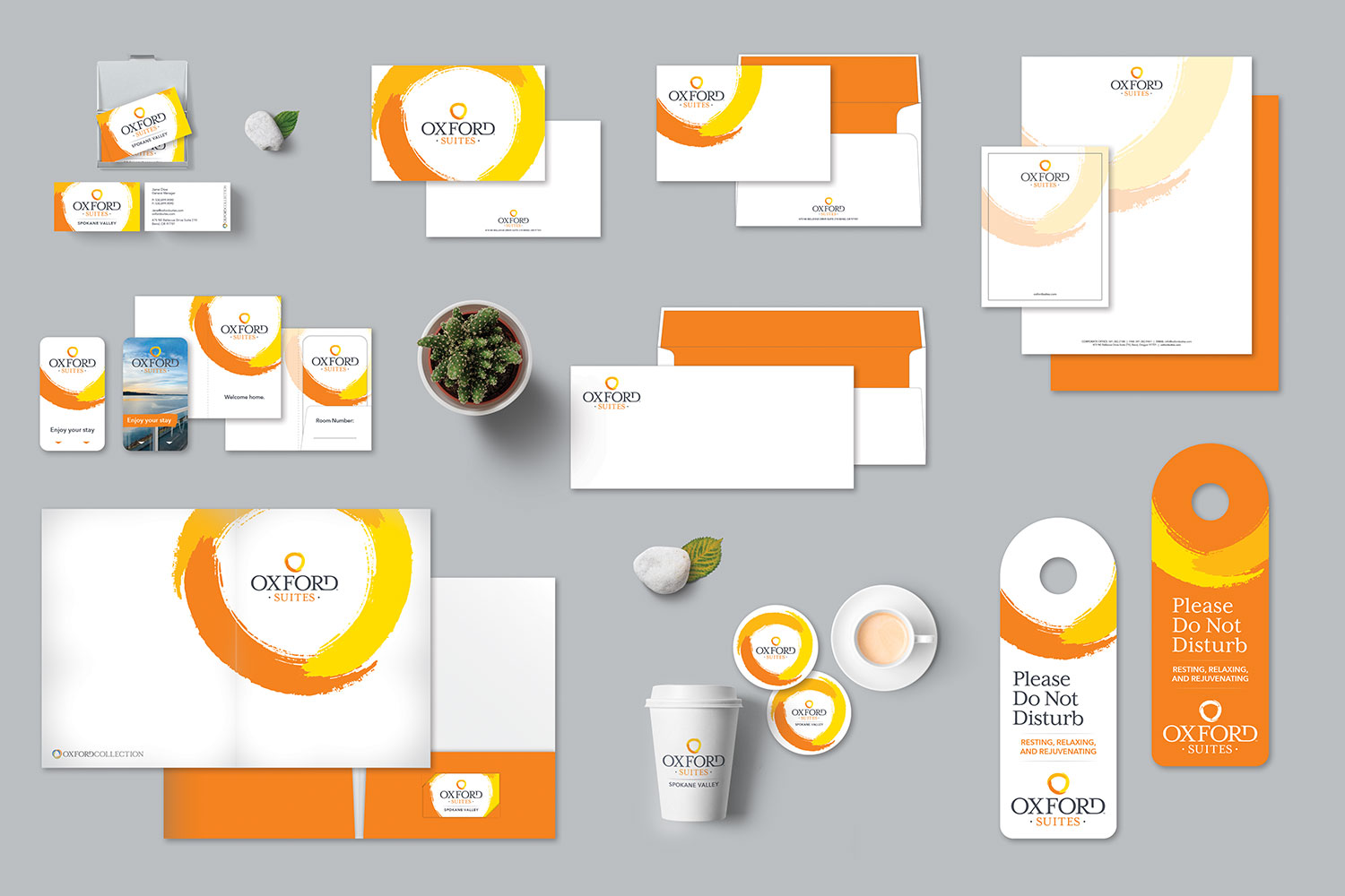
The Oxford Suites offering has grown to include new cities and a higher level of comfort for budget-conscious travelers so they needed a new look to entice new customers while honoring their longtime brand. We cleaned up the typeface and created an entirely new logo that both told our story and increased drive-by visibility. The logo consists of hand-painted strokes because each property in the portfolio is designed individually by Oxford to reflect the local community they call home. The shades of orange were used to show our variety of locations and their consistent service. For our booked guests and walk-in guests, the logo makes finding us easy and makes our brand stand out among competitors. Our messaging and imagery is designed to focus on each properties individuality and connection to the local art, music, food, and beverages that we offer every guest. When you stay at an Oxford Suites we want you to feel like you’ve experienced our town not just our hotel.

For the Oxford Hotel, we dropped “The” from the official logo and redesigned the logo to clean up a handmade font and make it easier to use at smaller sizes. We changed the color palette from browns and earth tones to include more green since it is a more welcoming color and indicative of the Central Oregon evergreens. We selected more lifestyle imagery for the advertising and outbound communications while reimagining the Aspen branches used in some of the marketing as a ubiquitous icon for the property. We use copy and images to position ourselves as having access to all of the outdoors of Central Oregon while being centrally located in downtown Bend.
Our affluent 30+ market that visits Central Oregon for hiking, biking, fishing, and other outdoor activities simply aren’t ready to call it a night at 6 pm, so focusing on our nightlife and walking access to downtown set us apart from price point competitors in remote locations.